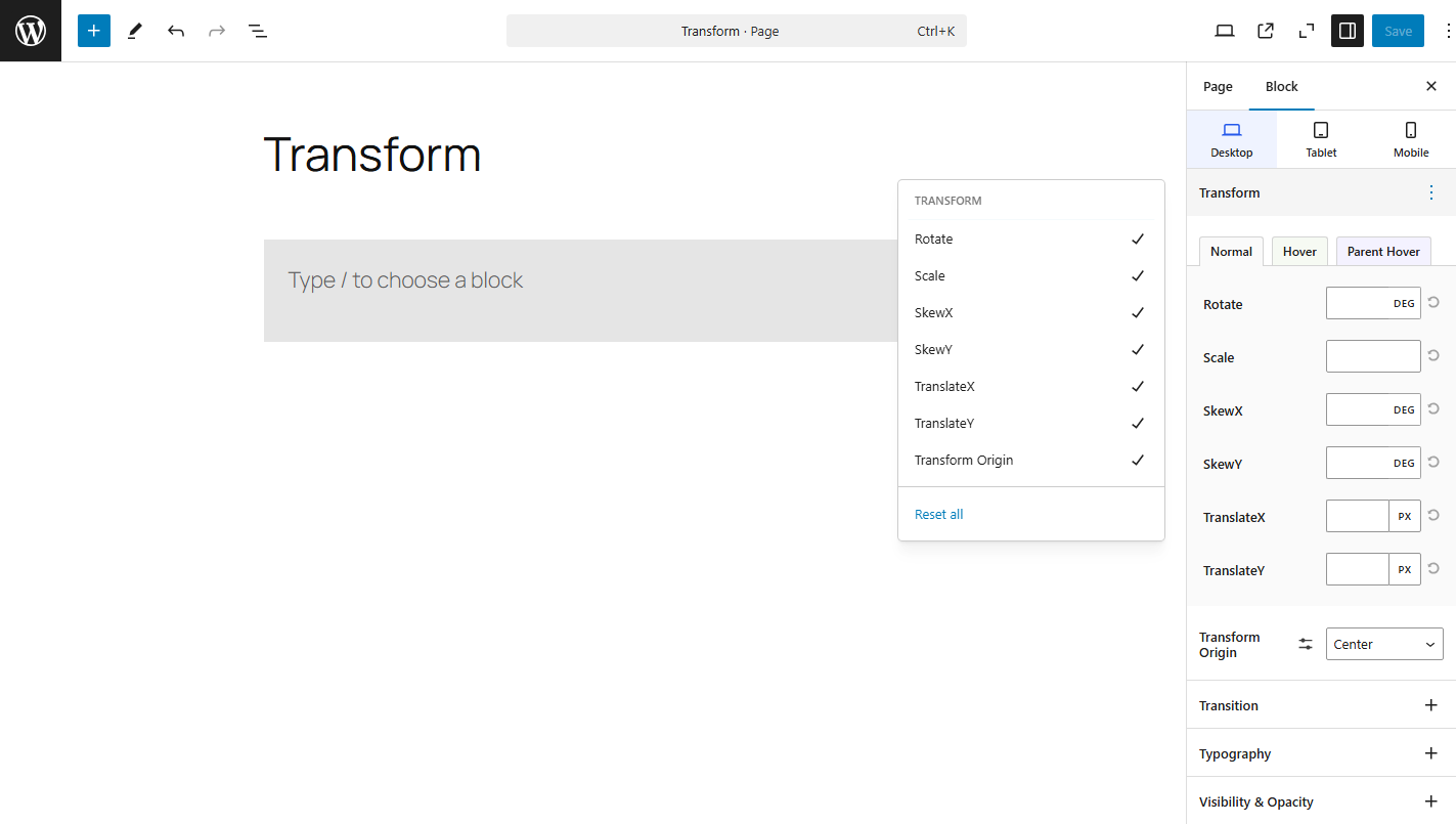
CSS transform property allows you to apply various transformations to an element. These transformations can modify the position, shape, and orientation of an element. Below are the commonly used transform functions:

- Rotate
Therotatefunction rotates an element around a fixed point (the element’s origin) by a specified angle. The angle is typically given in degrees (deg). - Scale
Thescalefunction resizes an element. You can scale an element proportionally (uniform scaling for both width and height) or non-proportionally (separate scaling for width and height). - SkewX
TheskewXfunction slants or skews an element along the X-axis by a specified angle. It does not change the element’s position but distorts its shape. - SkewY
TheskewYfunction skews an element along the Y-axis by a specified angle, similar toskewX(), but applied vertically. - TranslateX
ThetranslateX()function moves an element along the X-axis by a specified distance. This is useful for shifting elements horizontally. - TranslateY
ThetranslateY()function moves an element along the Y-axis by a specified distance. This is useful for shifting elements vertically.
Transform Origin
The transform-origin property defines the origin point around which transformations like rotate, scale, skew, and translate occur. By default, transformations happen around the center of the element, but you can change the origin point to any other position (top, bottom, left, right, or custom coordinates).