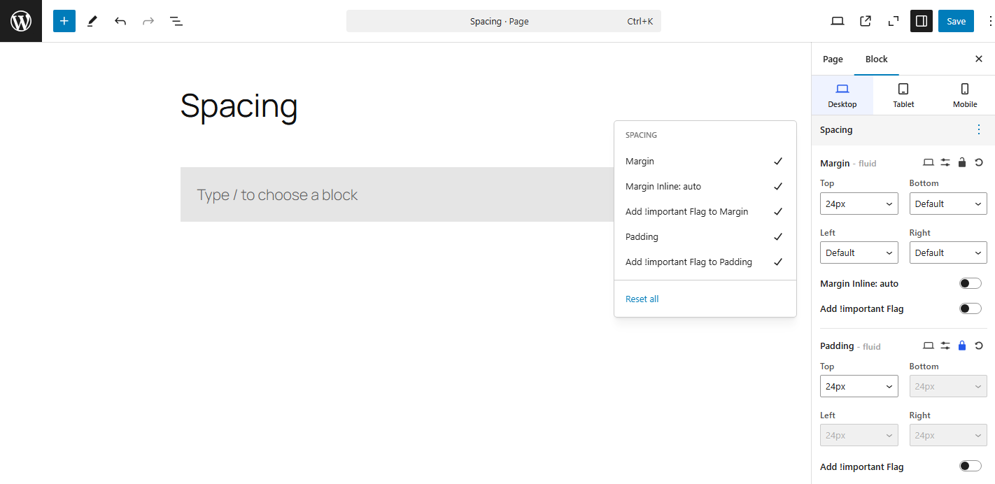
Spacing is a crucial aspect of web design that impacts the readability, visual appeal, and overall usability of a website. Proper spacing between elements ensures that content is clear, organized, and aesthetically pleasing. In CSS, spacing is managed using various properties that control the margins, and padding between elements. Understanding these properties and how to apply them effectively helps create well-structured layouts.

Fluid Spacing
It is a technique used in web design to create layouts that adjust dynamically to varying screen sizes and content. Rather than using fixed pixel values for spacing, fluid spacing uses relative units like percentages, em, rem, vw, or vh to ensure the spacing between elements is flexible and scales proportionally. This approach is essential for building responsive, mobile-first websites that adapt smoothly across different devices and screen resolutions.
Responsive Spacing
It is a crucial aspect of modern web design that ensures consistent, user-friendly layouts across a variety of devices and screen sizes. With the rise of mobile-first design, it’s important to adjust not only the layout and content but also the spacing between elements, so they look good and are easy to interact with on all screen sizes — from mobile phones to large desktop monitors.
Responsive spacing allows your website to maintain a balanced design by dynamically adjusting the margins and padding based on the viewport size (the size of the user’s screen). By using responsive design techniques, you can ensure that your site remains functional, aesthetically pleasing, and usable on every device.
1. Margin
The margin property defines the space outside the border of an element. It controls the distance between the element and its surrounding elements, whether they are other elements or the edges of the viewport. Margins are essential for controlling the layout and creating proper spacing between elements in a webpage.
Margins are commonly used to:
- Separate elements for better readability.
- Create empty space between sections, such as between paragraphs, headings, or divs.
Margins do not add space inside the element itself. They only affect the space around it. This property is one of the fundamental tools for building layouts in CSS.
Margin Auto for Centering Elements
One of the most common uses of margins in CSS is for centering an element horizontally within its parent container. By setting the left and right margins to auto, the element will be centered.
Negative Margins
You can also use negative margins to pull elements closer together, or even overlap them. This is especially useful in some design scenarios, such as creating overlapping elements or pulling content closer.
2. Padding
The padding property in CSS is used to create space inside an element, between the element’s content and its border. Padding is essential for improving the visual structure of elements, making sure content doesn’t touch the edges of the element, and adding extra “breathing room” for better readability and usability.
Just like the margin property, padding is a critical part of layout design, but while margin controls the space outside an element, padding affects the space inside the element.