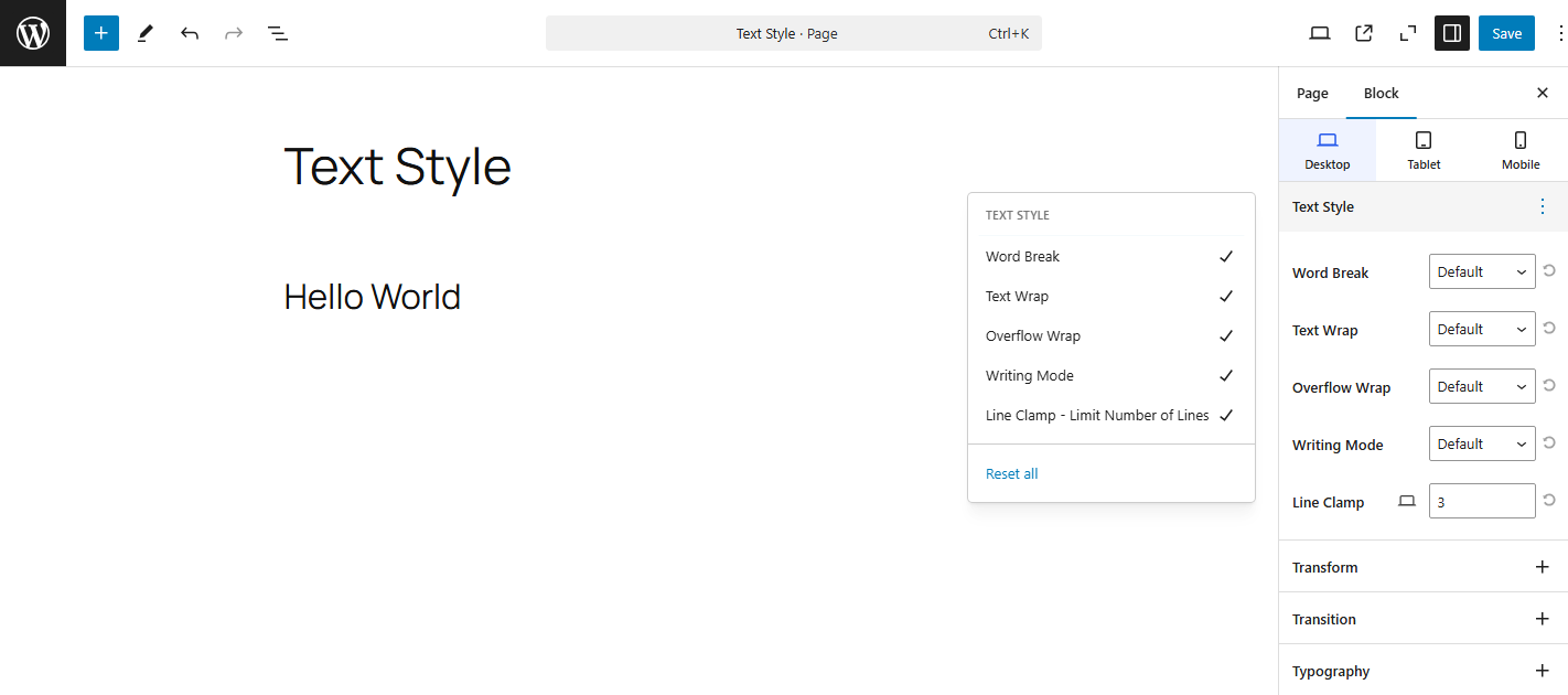
1. Word Break
The word-break CSS property sets whether line breaks appear wherever the text would otherwise overflow its content box.
default: Use the default line break rule.break-all: To prevent overflow, word breaks should be inserted between any two characters.keep-all: Has the same effect asoverflow-wrap: anywherecombined withword-break: normal, regardless of the actual value of theoverflow-wrapproperty.
2. Text Wrap
Text wrapping refers to how text behaves when it reaches the edge of its containing element.
default: Use the default line break rule.balance: Text is wrapped in a way that best balances the number of characters on each line, enhancing layout quality and legibility. Because counting characters and balancing them across multiple lines is computationally expensive, this value is only supported for blocks of text spanning a limited number of lines.wrap: Text is wrapped across lines at appropriate characters (for example spaces, in languages like English that use space separators) to minimize overflow. This is the default value..nowrap: Text does not wrap across lines. It will overflow its containing element rather than breaking onto a new line.
3. Overflow Wrap
The overflow-wrap CSS property applies to text, setting whether the browser should insert line breaks within an otherwise unbreakable string to prevent text from overflowing its line box.
default: Words will only break at spaces or punctuation marks, and long words that don’t fit within the container will overflow.anywhere: To prevent overflow, an otherwise unbreakable string of characters — like a long word or URL — may be broken at any point if there are no otherwise-acceptable break points in the line. No hyphenation character is inserted at the break point. Soft wrap opportunities introduced by the word break are considered when calculating min-content intrinsic sizes.break-word: Withoverflow-wrap: break-word;, long words or strings (such as URLs or long words without spaces) can break and wrap onto the next line to avoid overflow.
4. Writing Mode
writing-mode is a CSS property that defines the direction in which the text content is laid out and the direction in which lines of text are stacked. This property allows you to change the default horizontal left-to-right writing flow to a variety of different orientations, such as vertical, top-to-bottom, and right-to-left.
It is commonly used for supporting languages that are written vertically (like Japanese, Chinese, and Korean) or for creating unique text layouts.
default: The default writing mode. Text is laid out horizontally (left-to-right) with lines stacked from top to bottom.vertical-rl: Text is laid out vertically, with lines stacked from right to left. Common in East Asian writing systems (Japanese, Chinese, Korean).
Vertical text is written in columns from top to bottom, starting on the right side.vertical-lr: Text is laid out vertically, but the lines are stacked from left to right.sideways-rl: Forltrscripts, content flows vertically from top to bottom. Forrtlscripts, content flows vertically from bottom to top. All the glyphs, even those in vertical scripts, are set sideways toward the rightsideways-lr: Forltrscripts, content flows vertically from bottom to top. Forrtlscripts, content flows vertically from top to bottom. All the glyphs, even those in vertical scripts, are set sideways toward the left.
5. Line Clamp
line-clamp is a CSS technique used to truncate multi-line text and display an ellipsis (...) when the content exceeds a specified number of lines. It’s useful when you want to limit text length in cards, previews, or summaries without cutting off the entire block.