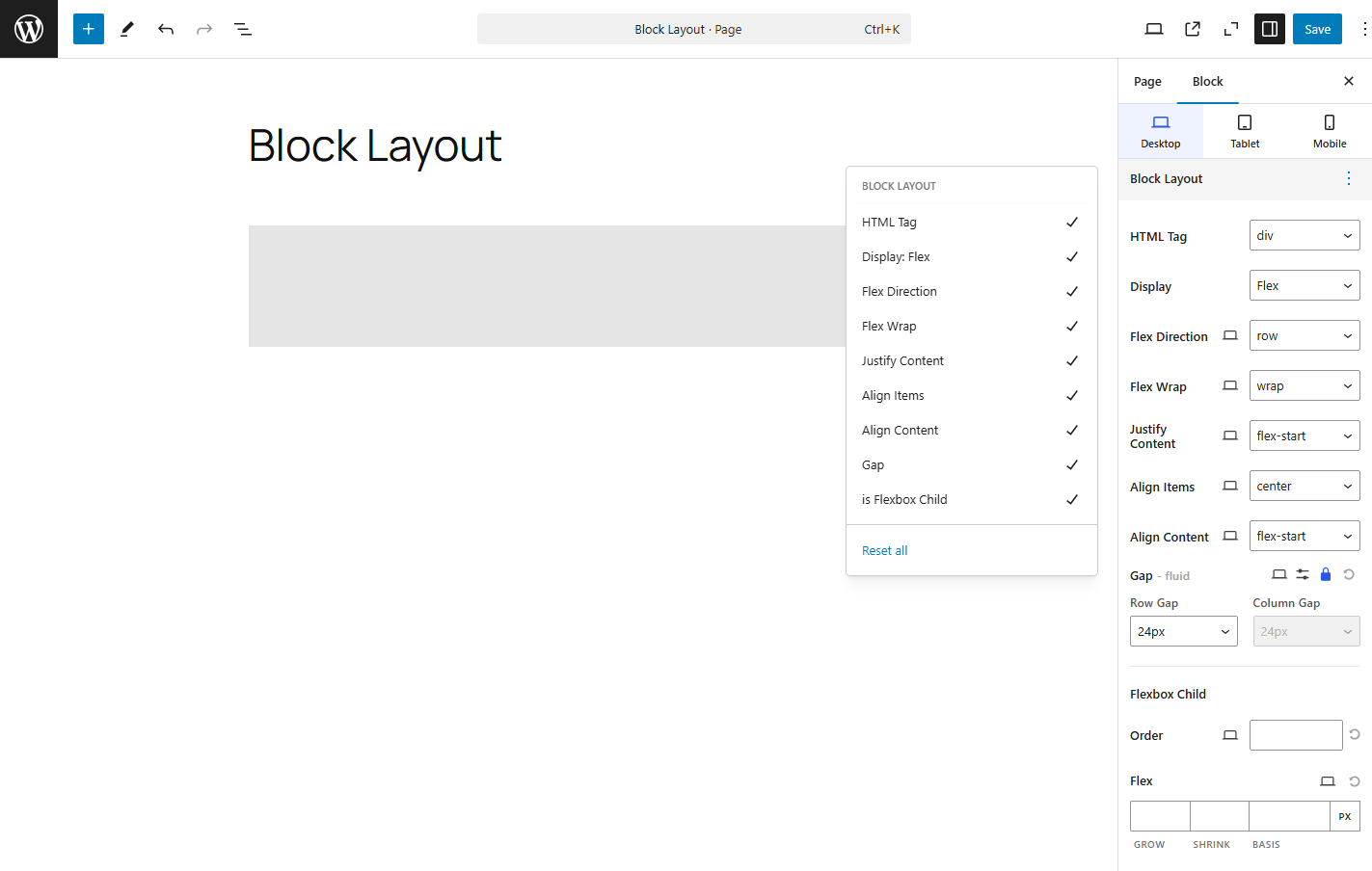
1. HTML Tag
In HTML (HyperText Markup Language), tags are the basic building blocks used to structure and format the content on a webpage.
2. Display
- Flex
Flexbox (short for Flexible Box Layout) is a layout model in CSS that allows you to design complex layouts with ease, making it easy to distribute space along a container, even when the sizes of the items are unknown or dynamic.
Flexbox is particularly useful for creating responsive layouts and aligning elements efficiently in a container, both horizontally and vertically. - Inline Flex
Theinline-flexvalue is a variation of theflexdisplay property in CSS. It is used when you want to apply Flexbox layout but keep the container inline-level (i.e., it behaves like an inline element rather than a block-level element).
Flex Direction
The flex-direction property in CSS defines the main axis of a flex container. It determines the direction in which the flex items (children) are laid out.
By default, flex items are arranged horizontally, but with the flex-direction property, you can control whether they appear in rows, columns, or reversed.
Flex Wrap
The flex-wrap property in CSS controls whether flex items stay on one line or wrap onto multiple lines inside a flex container. By default, flex items try to fit on a single line, but with flex-wrap, you can allow them to wrap if there’s not enough space.
Justify Content
The justify-content property is used in Flexbox to align items along the main axis — which is horizontal by default (flex-direction: row) or vertical if flex-direction: column.
It controls how space is distributed between and around flex items within a container.
Align Items
The align-items property is used in Flexbox to control vertical alignment of flex items along the cross axis (which is vertical by default, when using flex-direction: row).
It sets how flex items are aligned relative to the container.
Align Content
The align-content property is used in Flexbox to control the spacing between rows (or columns if using flex-direction: column) along the cross axis — but only when there are multiple lines of items (i.e., when wrapping occurs).
It only works when items wrap using flex-wrap: wrap or wrap-reverse.
Gap
The gap property defines the space between items in a Flexbox layout.
It helps you add consistent spacing between rows and columns without using margins on individual items.
2. Flexbox Child
- Order
Theorderproperty in Flexbox lets you control the order in which items appear, independent of their HTML source order.
This means you can visually rearrange items without changing the markup. - Flex Grow
Theflex-growproperty tells a flex item how much it should grow relative to the other items inside a flex container.
It’s used to control how extra space in the flex container is distributed among the items. - Flex Shrink
Theflex-shrinkproperty tells a flex item how much it should shrink relative to the other items when there isn’t enough space in the flex container. - Flex Basis
Theflex-basisproperty defines the initial size of a flex item before any growing or shrinking happens.
Think of it as the starting point for how wide or tall a flex item wants to be (depending on the flex direction). - Align Self
Thealign-selfproperty is used in Flexbox layout to override the alignment of a specific flex item within its container, allowing you to adjust its positioning along the cross axis (vertical axis, by default).
This property is particularly useful when you need to align an individual item differently, while keeping the other items aligned as per the container’s alignment.